Statistics for Decision Makers - 04.01 - Bivariate Data
Jump to navigation
Jump to search
<slideshow style="nobleprog" headingmark="。" incmark="…" scaled="false" font="Trebuchet MS" footer="www.NobleProg.co.uk" subfooter="Training Courses Worldwide">
- title
- 04.01 - Bivariate Data
- author
- Bernard Szlachta (NobleProg Ltd) bs@nobleprog.co.uk
</slideshow>
What is Bivariate Data?。
- Bivariate data consists of two quantitative variables for each individual
- Often, more than one variable is collected on each individual
- Example
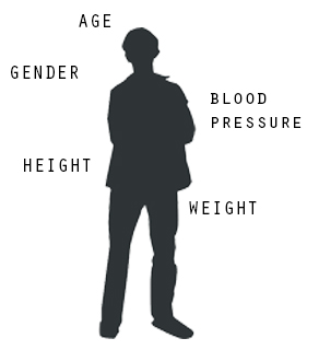
- Age, gender, height, weight, blood pressure, and total cholesterol
- Personal income and years of education
- High school grade point average and standardized admission test scores (e.g., SAT)
How can we summarise such data in a way that is analogous to summarizing univariate (single variable) data?
Example。
Do people tend to marry other people of about the same age?
- One way to address the question is to look at pairs of ages for a sample of married couples
- Table below shows the ages of 10 married couples
- Going across the columns, husbands and wives tend to be of about the same age, with men having a tendency to be slightly older than their wives

| ||||||||||
| Husband | 36 | 72 | 37 | 36 | 51 | 50 | 47 | 50 | 37 | 41 |
|---|---|---|---|---|---|---|---|---|---|---|
| Wife | 35 | 67 | 33 | 35 | 50 | 46 | 47 | 42 | 36 | 41 |
Example。

|
Mean | Standard Deviation | |
|---|---|---|---|
| Husbands | 49 | 11 | |
| Wives | 47 | 11 |
- The pairs of ages in the table below are from a dataset consisting of 282 pairs of spousal ages
- Each variable can be summarized by a histogram and by a mean and standard deviation as shown above
- Each distribution is fairly skewed with a long right tail
- Lost information
From the first table (previous slide), we see that not all husbands are older than their wives
- this fact is lost when we separate the variables
- the pairing within couple is lost by separating the variables
- More examples of lost information
- What is the average age of husbands with 45-year-old wives?
- What is the relationship between the husband's age and the wife's age?
- What percentage of couples has younger husbands than wives?
- Only by maintaining the pairing can meaningful answers be found about couples per se
Scatter Plot。
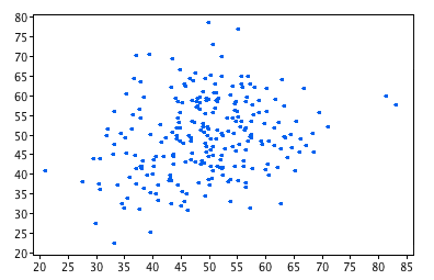
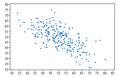
| r=.24 | r=-.69 |
|---|---|
|
|
- A scatter plot displays the bivariate data in a graphical form that maintains the pairing.
- Scatter plots that show linear relationships between variables can differ in several ways including:
- The slope of the line about which they cluster
- How tightly the points cluster about the line
Example 1。
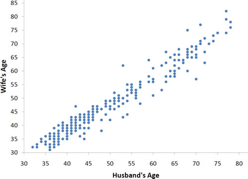
There are two important characteristics of the data revealed by the scatter plot above.
- The older the husband, the older the wife (positive association)
- The points cluster along a straight line (linear relationship)
Example 2。
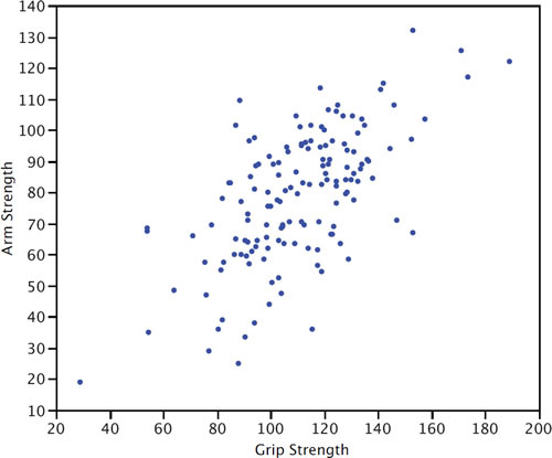
Arm Strength and Grip Strength from 149 individuals:
- The stronger someone's grip, the stronger their arm tends to be (positive association)
- Not as strongly correlated as previous example
Example 3。
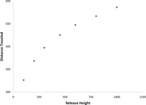
Not all scatter plots show linear relationships.
- Galileo projectile motion experiment
- Galileo rolled balls down an incline and measured how far they travelled as a function of the release height
- Relationship between "Release Height" and "Distance Traveled" is not described well by a straight line
- If you drew a line connecting the lowest point and the highest point, all of the remaining points would be above the line
- The data are better fit by a parabola
