R - Graphics
Bar chart
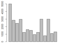
Let us start with a simple bar chart graphing salary from the emp table.
emp <- read.table("https://training-course-material.com/images/9/97/Emp.txt",header=TRUE)
barplot(emp$SAL)
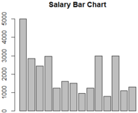
We can define the title of the graph with 'main' function.
barplot(emp$SAL, main="Salary Bar Chart")
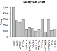
We can also label Y-Axis using 'ylab' function and extract the X-Axis values from the ENAME column using 'names' function.
barplot(emp$SAL, main="Salary Bar Chart", ylab="Salary", names.arg=emp$ENAME, las=2)
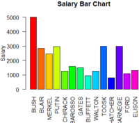
Now let's make it pretty by using some color.
barplot(emp$SAL, main="Salary Bar Chart", ylab="Salary", names.arg=emp$ENAME, las=2, col=rainbow(15))
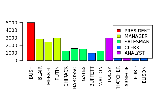
Legend
l <- list(MANAGER=2,
          CLERK=3,
          SALESMAN=4,
          PERSIDENT=5,
          ANALYST=6)
jobcolors <- as.integer(l[emp$JOB]);
barplot(emp$SAL,names.arg = emp$ENAME, las=2
         ,col=jobcolors)
legend("top",
       legend = names(l),
       fill = as.integer(l))
We can also generate colours automatically
jobs = as.character(unique(emp$JOB))
noofcol=length(jobs)
cols_no <- rainbow(noofcol)
cols = cols_no;
# list l should have $MANAGER -> FF0000FF, $PRESIDENT -> ......
names(cols) <- jobs
position_cols <- cols[as.character(emp$JOB)]
barplot(emp$SAL,names.arg = emp$ENAME, las=2
        ,col=position_cols)
legend("right",
       legend = jobs,
       fill = cols_no
       )
par function
- In the previous example, where the las paramter is commign from?
- If you try to type ?las
- Las come from par function
- Stands for Label Axis Style
Color coding for JOB
 l <- list(MANAGER=2,
          CLERK=3,
          SALESMAN=4,
          PERSIDENT=5,
          ANALYST=6)
 barplot(emp$SAL,names.arg = emp$ENAME, las=2
         ,col=as.integer(l[emp$JOB]))
Pie Chart
Let us make a simple Pie Chart graphing the salary from the emp table.
pie(emp$SAL)
TODO: chart
It is pretty useless unless we have labels right
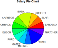
Now let's add a title, label with names of the employees and change the colors.
pie(emp$SAL, main="Salary Pie Chart", labels=emp$ENAME, col=rainbow(15))
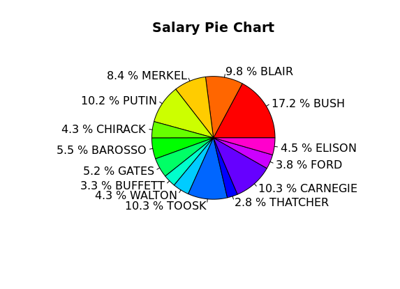
We can also use percentage of the salary to label the pie chart.
 SAL_labels <-  round(emp$SAL/sum(emp$SAL) * 100, 1)
 SAL_labels <- paste(SAL_labels,"%")
 SAL_labels <- paste(SAL_labels,emp$ENAME)
 pie(emp$SAL, main="Salary Pie Chart", labels=SAL_labels, col=rainbow(15))
Table Function
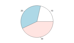
Table function returns frequency of a factor > table(emp$DEPTNO)
10 20 30
 3  5  6
How many people work in specific departments
par(mar=c(0,0,0,0))
pie(table(emp$DEPTNO))
Box Plot
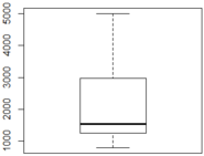
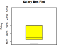
Box Plots graphically depict groups of numerical data through minimum, lower quartile (Q1), median (Q2), upper quartile (Q3) and maximum points.
boxplot( ) function is used to provide point identification, labels, and a formula interface for box plots without a grouping variable.
Let us draw a simple box plot for salary.
boxplot(emp$SAL)
We can added the head, label and some colors.
boxplot(emp$SAL, main="Salary Box Plot", ylab="Salary", col=c("yellow"))
Quantile-Comparison Plot
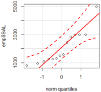
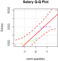
Quantile-Comparison Plot is a probability plot, a graphical way of comparing two probability distributions by plotting their quantiles against each other. We can use qqPlot() function to create a Q-Q Plot.
install.packages("EnvStats")
library(EnvStats)
qqPlot(emp$SAL, dist="norm")
Let us add the head, label for y axis and some colors.
qqPlot(emp$SAL, dist="norm", main="Salary Q-Q Plot", ylab="Salary", col=rainbow(15))
Plot
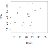
We can use plot() function for plotting of R objects.
Let us use gpa table to create a simple Plot.
gpa <- read.table("https://training-course-material.com/images/8/86/Study-time-gpa.txt",h=T)
plot(gpa)
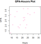
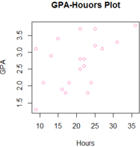
Now let us make it pretty.
plot(gpa, main="GPA-Houors Plot", col="hotpink")
Scatter Plot
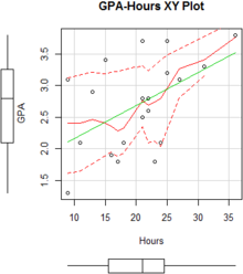
We can use scatter plots when a variable exists that is under the influence of the experimenter.
GPA is under the control of the hours on the gpa table so we can create the scatter plot using scaterplot() function.
library('car')
scatterplot(GPA~Hours, reg.line=lm, smooth=TRUE,
            spread=TRUE, boxplots='xy', span=0.5, data=gpa)
XY Plot
library(lattice)
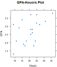
xyplot(GPA ~ Hours, pch=16,main="GPA-Houors Plot",
       auto.key=list(border=TRUE), par.settings = simpleTheme(pch=16),
       scales=list(x=list(relation='same'), y=list(relation='same')), data=gpa)
Graph Exercise
Use 'sales' table and 'gpa' table for the questions below
sales <- read.table("https://training-course-material.com/images/8/8f/Sales.txt",header=TRUE)
gpa <- read.table("https://training-course-material.com/images/8/86/Study-time-gpa.txt",h=T)
- Create a Barchart for the sales by country (use 'sales' table).
- Create a Pie Chart with the percentage of the total sales by country (use 'sales') table.
- Create a Box Plot for the sales (use 'sales' table).
- Create a Plot (use 'gpa' table).
Answers
Answers are in source code 1. Create a Barchart for the sales by country.
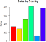
2. Create a Pie Chart with the percentage of the total sales by country.
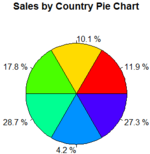
3. Create a Box Plot for the sales.
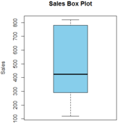
4. Create a Plot using the gpa table.
