Bootstrap 3 vs 4
Jump to navigation
Jump to search
<slideshow style="nobleprog" headingmark="⌘" incmark="…" scaled="true" font="Trebuchet MS" >
- title
- Bootstrap 3 vs. 4
- author
- Lukasz Sokolowski
</slideshow>
Intro ⌘
At the stage of HTML coding:
- it is always important to have at hand a good tool that will greatly accelerate the development process
- It should be flexible, easily customizable and will allow you to easily create mockups
- It should allow you to easily create pages that are well displayed on desktops and mobile devices
Bootstrap ⌘
A powerful CSS framework for creating adaptive pages that includes:
- multiple-column adaptive grid
- ready-made elements by type of navigation, buttons, dropdowns, etc
- set of service classes for controlling the behavior of elements
- reset or normalize
- set up the typography in the template
- mediaobjects
- Some JS-plugins (Carousel, Modal and so on)
- and much more
B3 vs B4 ⌘
- Almost identical set of components and utilities
- But there are a lot of differences
Sass vs Less ⌘
Source code for Bootstrap 4 uses Sass, Bootstrap 3 – Less
- Sass is recognized as the most widely used CSS preprocessor
- The code written on it is more readable and understandable
- Functional is slightly better than competitors
Flexbox vs Floats ⌘
- In the 4th version you have no problem aligning vertically and the problem of columns of the same height
- Change the vertical and horizontal alignment on different devices using utilities and classes, such as: align-item-center, align-items-md-center, align-items-lg-start, and so on
- Change the order of your columns using flex-unordered, flex-last, flex-first
- Use mr-auto, ml-auto, which will align your element to the right or left
- Live example
Responsive columns ⌘
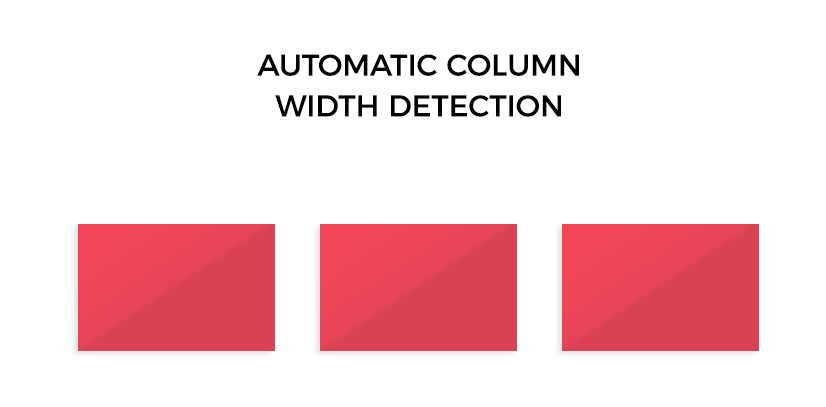
- Columns of the same width without specifying the explicitly labeled class numbers
- Inside your row just place as many “div” with the class col as you need and they will have the same width
- The result is 3 columns of the same width on all devices (there was no such possibility in the 3rd version)
<div class="row">
  <div class="col">1</div>
  <div class="col">2</div>
  <div class="col">3</div>
</div>
Responsive columns Con't ⌘
Responsive con't ⌘
- It is possible to create columns that change their width depending on the content
- To do this, you need to use the following class
- col-md-auto (instead of md substitute the another breakpoint)
Media queries ⌘
We have the opportunity to more flexible approach to changes styles of the page on various devices
- in the grid system there are the following breakpoints:
extra large (>= 1200px) large (>= 992px) medium (>= 768px) sm (>= 576px) xs (< 576px)
- In the B3 of these breakpoints there were only 4
- this sometimes created some problems when marking on small tablets and phones with a big screen
Flexible Con't ⌘
- Not all elements in Bootstrap 4 have display: flex property
- If you need to make a 'flex' element, then you should use the display utility
- For example, add a class .d-flex, .d-inline-flex, or .d-sm-flex, when you need to apply the utility only for devices of the sm category and above
- For an item with the .d-flex class, there is a set of flex utilities with which
- you can change the axis of the container,
- reverse the order,
- align elements inside the container, and so on.
- these include: flex-row, flex-row-reverse, .flex-column, .flex-column-reverse, .flex-sm-row, .justify-content-start, .justify-content-start, .justify-content-sm-start and other variations
Typography ⌘
The section of the typographies have improved indentation system for different elements (p, ul, etc.)
Migration to B4 ⌘
- Official docs
- Converting
- One of many available exmaples

