Bootstrap for Web Developers
<slideshow style="nobleprog" headingmark="⌘" incmark="…" scaled="true" font="Trebuchet MS" >
- title
- Bootstrap for Web Developers
- author
- Hao Wang, NobleProg
</slideshow>
We love bootstrap ⌘
- Fast Prototyping
- Easy to use ( no JS needed for "it works" experience )
- Popular http://expo.getbootstrap.com/
One more reason ⌘
<head>
  ...
  <meta http-equiv="X-UA-Compatible" content="IE=edge"><!-- IE latest -->
  <!--[if lt IE 9]>
    <script src="https://oss.maxcdn.com/html5shiv/3.7.2/html5shiv.min.js"></script>
    <script src="https://oss.maxcdn.com/respond/1.4.2/respond.min.js"></script>
  <![endif]-->
</head>
Dev Bench Setup ⌘
- Sublime
- Syntax Highlight
- Emmet
- Git
- Editor Config
- Chrome browser
Getting Started ⌘
Precompiled ⌘
Source Code ⌘
- https://github.com/twbs/bootstrap/releases (less, docs)
Compiling CSS and Javascript ⌘
- grunt
Installing Grunt ⌘
- sudo npm install -g grunt-cli
Available Grunt commands ⌘
- grunt dist (Just compile CSS and JavaScript)
- grunt watch (Watch)
- grunt test (Run tests)
- grunt docs (Build & test the docs assets)
- grunt (Build absolutely everything and run tests)
Troubleshooting ⌘
- Install ruby ruby-gen bundle jekyll
- sudo apt-get install ruby-full
- https://rubygems.org/pages/download (cd there, ruby setup.rb)
- sudo apt install ruby-bundler
- gem install jekyll
- FATAL: Listen error: unable to monitor directories for changes.
- echo fs.inotify.max_user_watches=524288 | sudo tee -a /etc/sysctl.conf && sudo sysctl -p
Examples ⌘
- examples
- how to grab it
Bootlint ⌘
- Add this to bookmark url
javascript:(function(){var s=document.createElement("script");s.onload=function(){bootlint.showLintReportForCurrentDocument([]);};s.src="https://maxcdn.bootstrapcdn.com/bootlint/latest/bootlint.min.js";document.body.appendChild(s)})();
CSS ⌘
Grid system ⌘
- See bs3/test/
Typography ⌘
Code ⌘
Tables ⌘
Forms ⌘
Buttons ⌘
- .btn-block // upgrade to it block, try it
- Not too many colors
- .disabled class not really does the job. Use attribute disabled="disabled", try it
- Navbar only supports button element, not .btn class which both <a> and <button> support
- <button> is recommended over <a> because it is supported better across all browsers
- try it /test/buttons.html
Images ⌘
- <img src="..." class="img-responsive" alt="Responsive image">
Helper classes ⌘
- text-primary
- bg-primary
- clearfix
Responsive utilities ⌘
Responsive utilities 1 ⌘
- xs: mobile size
- sm: tablet size
- md: laptop or small screen desktop size
- lg: desktop or big screen laptop size
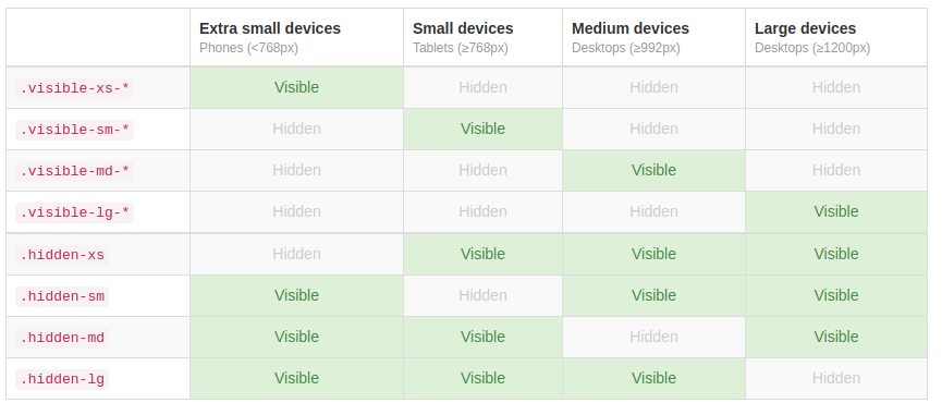
Responsive utilities 2 ⌘
Responsive utilities 3 ⌘
- .visible-xs-block
- .visible-xs-inline
- .visible-xs-inline-block
- .visible-sm-block
- ..
- .visible-md-block
- ..
- .visible-lg-block
- ..
Components ⌘
Glyphicons ⌘
<span class="glyphicon glyphicon-search" aria-hidden="true"></span>
- https://loading.io/
- http://fontawesome.io/ originally designed for Bootstrap
Dropdowns ⌘
Button groups ⌘
Button dropdowns ⌘
Input groups ⌘
Breadcrumbs ⌘
Pagination ⌘
Labels ⌘
Badges ⌘
Jumbotron ⌘
Page header ⌘
Thumbnails ⌘
Alerts ⌘
- JS version has close button
Progress bars ⌘
Media object ⌘
List group ⌘
Panels ⌘
Responsive embed ⌘
Wells ⌘
Javascript ⌘
Overview ⌘
Transitions ⌘
Modal ⌘
- give it a try
- try force it show up when page load, disable keyboard and ESC Key
Dropdown ⌘
Scrollspy ⌘
Tab ⌘
Tooltip ⌘
- helpful when icon is not enough, try it
- view port self-adjusting ,try it
Popover ⌘
Alert ⌘
Button ⌘
Collapse ⌘
Carousel ⌘
Affix ⌘
Customize ⌘
- https://www.bootstrap-live-customizer.com/
- https://getbootstrap.com/docs/3.3/customize/
- https://pikock.github.io/bootstrap-magic/app/index.html#!/editor
Ex. ⌘
- see example: boostrap-template-1
- Assume visual design is ready. Customize Link color, Button color


